What Has Moulin Rouge to Do with the History of Advertisement Posters?

24 February 2022

The newspapers have been very kind to your offspring. I'm sending you a clipping written in the honey ground in incense. My poster has been a success on the walls.

 - Henri de Toulouse-Lautrec


Which Advertisement Poster was Lautrec Talking About? To Get to The Answer to that One, Let Us Try Answering The Following One:

Do you already know that?

Or

Are you waiting for me to spill the beans?

If yes, read on!

If not, read on! And unravel the surprise.

Moulin Rouge!

Yes, a musical romantic drama film directed by Baz Luhrmann and also a hugely famous cabaret with a red windmill (English Translation of Moulin Rouge) on its roof, in the Pigalle district, close to Montmartre in Paris, France.

But what else?

What could be the relationship of a place which is the birthplace of cabaret can-can dance, which breathes bohemianism with the history of advertising?

Well, this birthplace of cabaret can-can dance is also the birthplace of experimentation with illustrated color lithography—a technique used to make posters. It is the location whose characters, dancers, and ambiance gave inspiration to artists and came alive in some of the first versions of the illustrated color lithographic posters. Developed by Jules Chéret using his 3 Stone Lithographic Process, with illustrated color lithography dawned the era of color and design on posters and with this dawn ushered in the modern age of advertising.

Source: www.iaddb.org

Development of the technique to produce illustrated color lithographic poster had made Paris, the capital of posters and Moulin Rouge, artists’ favorite destination for inspiration to play and innovate with the new technique.

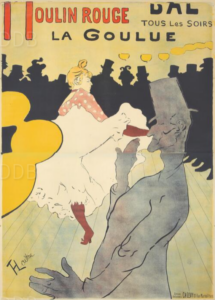
The most famous one out of the many posters Moulin Rouge found itself in is Moulin Rouge, La Goulue, poster for the Dance Hall Le Moulin Rouge by Henri de Toulouse-Lautrec.

In the year 1891, Lautrec was commissioned to create an advertisement poster for Moulin Rouge. He ended up creating La Goulue which turned out to be both an advertisement and an art poster. This advertisement cum fine art poster which was hugely different from what was being produced by Lautrec’s contemporaries, gifted Henri de Toulouse-Lautrec instant fame. 3000 copies of this poster were displayed in the streets of Paris in December 1891.

Lautrec has been reported to have written to his mother, “the newspapers have been very kind to your offspring. I’m sending you a clipping written in the honey ground in incense. My poster has been a success on the walls.”

Ernest Maindron, the first historian of posters, says about La Goulue that the poster “was so new and so completely unexpected that it was immediately noticed.” Describing his first encounter with the poster Francis Jourdain, the famous furniture and interior designer of those times, is reported to have said, “I still remember the shock I had when I first saw the Moulin Rouge poster. . . . This remarkable and highly original poster was, I remember, carried along the Avenue de l’Opéra on a kind of small cart, and I was so enchanted that I walked alongside it on the pavement.”

Lautrec’s love of depicting women realistically showed up in this poster also. Instead of an anonymous chérette, in this poster, he chose to depict a recognizable celebrity. This celebrity was La Goulue who was a celebrated star of Moulin Rouge known for her provocative and sensual high kick can-can dance.

This poster was unusual also in the sense of its size. It measured almost six and a half feet in height and three feet, three inches in width. Three sheets of paper were required to contain the whole poster. Thus, it is usually found with its upper band often cut out which can also be seen missing in the poster image of this blog post.

Moulin Rouge La Goulue, Henri de Toulouse-Lautrec’s first color lithographic poster with its firstness in the sense of dynamic depiction of its character, color usage, play with typography, employment of subjects, conceived out of the crossroads between fine art, reproduction, graphic design, and advertising paved one of the first paths for the further intermingling of these fields and resulting masterpieces.

Can we say: thanks to the life at Moulin Rouge?

If you find it worthwhile and wish to encourage discussion, share this post with your friends and family. This post is made possible by the support of Design Museum Dedel. Design Museum Dedel has a collection of over 150 years of advertising and design history in the form of posters. The poster collection is made accessible by the collaboration between Design Museum Dedel and Reclame Arsenaal (IADBB) whose aim is to preserve and manage the heritage of advertising and graphic design.

For more such interesting stories follow us on Instagram, Facebook and maybe visit Design Museum Dedel.

Chandrita Jaisinghani
Chandrita is a lifelong learner passionate about writing, creation, and marketing. She loves accessing and assessing her inner self through poetry and literature. Learn more about her on her  website . You can also reach her at chandritawriter@gmail.com .

What Problem Does a Logo Design Solve?

31 januari 2022

“Everything is design. Everything!”

-Paul Rand, the legendary American graphic designer

What Problem Does a Logo Design Solve?

"Everything is design. Everything!”

True that!

From the beginning of your day till the end of it, everything you do or are involved in has some aspect of design in it. Even your thinking.

You wake up on a design marvel called bed. You light up the lamp which has been through centuries of design. Even the toothbrush design you hold every morning has eras of design behind it, beginning from 3500 B.C.E.

Even as I design this blog post, people are designing products, features, experiences, blending the creative and the conceptual with utility and functionality solving not only large scale problems but also everyday small ones.

But what about a logo design? Which problem does it solve?

Well, let us try to understand this with the help of IBM’s logo, the basic design of which has remained unchanged since 1972. Yes, since 1972.

IBM’s logo as is the poster below was designed by Paul Rand—the legendary American graphic designer who also designed logos for ABC, Morningstar, Inc., Steve Jobs’ NeXT, Yale University and Enron.

Source: www.iaddb.org

In 1924, IBM underwent a regrowth while working on a new design mission under the aegis of Thomas Watson Jr. It was making a move from being a Computing-Tabulating-Recording Company to being International Business Machines, IBM.

Paul Rand designed a 13 striped logo for IBM in order to solve the problem of representing its new transformed identity.

Today, IBM uses an 8 striped version of the same design, and for which IBM’s website says, “the IBM logo is one of our most valuable corporate assets. It’s among the most recognized corporate identities in the world, uniquely distinguishing us from our competitors and other companies. It’s the tangible symbol of our brand, representing everything we are: our expertise, our values, our people, our offerings.” IBM Developer Experience Guide having a dedicated page on IBM’s logo and its various forms for various purposes further connotes the value that resides in it.

So, Paul Rand’s design is an asset for IBM. Asset in business terms too.

A logo design is a powerful business tool and one which caters to the need of communication. It solves the problem of differentiating a brand in times of overcrowded marketplace. Along with that, it works by communicating visually what a brand stands for. And visual communication being primal for us humans, a logo quickly kindles us to generate and associate with meanings represented by the brand.

Therefore, one can safely say that logo designs not only solve communication problems but business problems too and bring good business as IBM’s Thomas Watson Jr once said, “good design is good business”.

If you find it worthwhile and wish to encourage discussion, share this post with your friends and family.

This post is made possible with the support of Design Museum Dedel. Design Museum Dedel has a collection of over 150 years of advertising and design history in the form of posters. The poster collection is made accessible by the collaboration between Design Museum Dedel and Reclame Arsenaal (IADBB).

For more such interesting stories follow us on InstagramFacebook and maybe visit our museum.

Chandrita Jaisinghani
Chandrita is a lifelong learner passionate about writing, creation, and marketing. She loves accessing and assessing her inner self through poetry and literature. Learn more about her on her website. You can also reach her at chandritawriter@gmail.com.

Don’t Leave as Thanks: The Netherlands’ Famous Anti-Litter Campaign

14 januari 2022

Citizens cleaning up litter on streets or in the forest area is a not so uncommon sight in the Netherlands. Especially on weekends, one can see people with gloves, bags and litter picker tongs, doing the job. The latest litter item being added to their bags is ‘masks’.

"Don’t Leave as Thanks"

The Netherlands’ Famous Anti-Litter Campaign

Of course, nothing to be glorified about. It’s normal to keep one’s surroundings clean.

But very important to mention the effort that these citizens are putting in. They are trying to remedy the abnormal behavior of leaving the waste anywhere one pleases to.

The awareness of urban litter being an environmental problem reached a high point in the Netherlands in 2021 with anti-litter activist Dirk Groot. On 21 June 2021, Leiden University published an article about his anti-litter activism titled, “How a Dutch man collecting 400,000 pieces of litter ended up on a scientific paper?”.

The article states that “anti-litter activist Dirk Groot photographed, tagged, and collected more than 400,000 pieces of litter in the Netherlands. Now, he and his data are included in a study on urban litter by researchers from Leiden University and Andrea Ballatore from Birkbeck, University of London.”

The fight against street litter is not a new one in the Netherlands.

Around 100 years back, Willy Sluiter’s graphics and Jacob Hendrik Slicher’s words were employed by Koninklijke Nederlandse Toeristenbond ANWB, the largest not-for-profit travelers' association in the Netherlands to create an anti-litter campaign.

The poster and the poem of the campaign became so famous that many food manufacturers wished to have the packaging of their products in the posters.

Laat niet als dank (Do not leave as thanks) became a common phrase and connoted that it is not normal to leave one’s waste just anywhere one pleases to.


Have a look at this almost hundred-year-old campaign in the posters below.

Source: www.iaddb.org

 Source: www.iaddb.org

If you find it worthwhile and wish to encourage discussion, share this post with your friends and family.

This post is made possible by the support of Design Museum Dedel. Design Museum Dedel has a collection of over 150 years of advertising and design history in the form of posters. The poster collection is made accessible by the collaboration between Design Museum Dedel and Reclame Arsenaal (IADBB).

For more such interesting stories follow us on InstagramFacebook and maybe visit our museum.

Chandrita Jaisinghani
Chandrita is a continuous learner passionate about writing, creation, and marketing. She loves accessing and assessing her inner self through poetry and literature. Learn more about her on her website. You can also reach her at chandritawriter@gmail.com.

What Does Branding Mean and How Has Its Meaning Evolved Through Time?

30 december 2021

Do you know who wrote Beowulf?

Beowulf - "the heroic poem, the crowning achievement of Old English literature, and the earliest European vernacular epic."

Scholars are yet to find an answer to that question.

But one question we'll try to answer today is, 'how has the word BRAND(ING) changed over time?' The word which first appeared in Beowulf, with its earliest connotations.

Come let's go after:

What Does Branding Mean and How Has Its Meaning Evolved Through Time?

In the episode: Brand Thinking and Design of the podcast: On Branding by Arek Dvornechuck,  Debbie Millman while defining the word Brand says,

“I think that a Brand is manufactured meaning. It is something that humans create in an effort to define and designate what something means, and you then communicate that via deliberate differentiation.”

Unquestionably this definition is interesting and it makes one even more curious to know how did we get to this definition.

Therefore without further adieu, let's examine the historical connotations of the word "brand" and the changes it underwent before it came to be used as a method of fostering consumer trust today.

The term for sure has come to possess a meaning both within and beyond commercial context. 

For example, have a look at the poster below (part of Design Museum Dedel's collection) from the archives of the International Advertising and Design Database. It's a poster for Ibsen's play and it serves both literary and marketing purposes.

Poster Source: www.iaddb.org

To Burn

So, moving all the way back to Old English times. The word brand evolved from Old English words byrnan, biernan, and brinnan, via Middle English words birnan and brond and also from Old Norse word brandr. All of those words have an association with the meaning 'to burn'.

Theft Prevention

Around 2500 BCE, in order to prevent theft, a burning piece of wood or metal was used to make identifying marks on the skin of livestock. Branding then only had a theft prevention connotation.

Marking, Labelling, and Claiming Ownership

Later tradesmen, potters, and artisans started engraving their products also to claim ownership. Here was then when the second connotative layer got added to the word branding and that was a process being adopted to label and claim one's products. Artists' Monograms and company logos are modern-day forms of these engravings.

Wikipedia states that “some of the earliest use of maker's marks, dating to about 1,300 BCE, have been found in India. The oldest generic brand in continuous use, known in India since the Vedic period (ca. 1,100 BCE to 500 BCE), is the herbal paste known as Chyawanprash, consumed for its purported health benefits and attributed to a revered rishi (or seer) named Chyawan.

Pitching Sales

The next layer of meaning got added when the concept of marketplace came into being. The competition then was not as cutthroat as it is today. So, marking or branding was mostly done to convey the features of the products to those coming to the market which was a way to pitch sales. It was used basically to bridge the gap between the product, the salesman, and the buyer.

Providing Value

As the marketplace became more competitive with a surge of local products sold by local merchants, the associated meaning shifted from just an explanation of product features for the purpose of pitching sales to providing unmatched value. Businesses invested so much in this connotation that Shakespeare’s “What’s in a name?” became “What’s in a name? Everything is in a brand name”.

Building Connection and Trust

In the 20th century, the idea of building emotional connection via branding gained traction and is being used to date. Amongst other things, this layer of meaning can be also seen in monograms and logos companies use. Looka, a design platform, in one of their blog posts, states that “the use of letters in monograms forms memorable acronyms and a deeper connection to the company name. This deeper connection is what drove and still drives loyalty.

Revolution

With a more socially conscious populace, moving away from conformity the marketplace has seen the growth of purpose-driven, risk-taking brands which lend their support to social causes. Along with that present-day connotation of branding is no longer limited to big businesses. In today’s era personal brand is as important as it is of an enterprise. LinkedIn is in fact an enterprise brand that is constitutive of various personal brands.

It’s being used by anyone and everyone who is willing to bring about a change and make the world a better place. The concept of branding now colors the efforts of individuals, politicians, social workers, and of course, of multimillion enterprises.

Thus branding today along with all the other connotative shades above also has an association with the ability to bring about revolutions.

And with the birth of brands like Brandless, maybe we will end up back in Beowulfian times but with an evolved, forward, connotative meaning of the word BRANDING.

It’s a feat that some of us enjoy the freedom to contribute to the evolving connotations of the meaning of the word branding. Let us use this freedom and the concept of branding to bring this freedom to people in the world elsewhere.

If you find it worthwhile and wish to encourage discussion, share this post with your friends and family.

This post is made possible with the support of Design Museum Dedel. Design Museum Dedel has a collection of over 150 years of advertising and design history in the form of posters. The poster collection is made accessible by the collaboration between Design Museum Dedel and Reclame Arsenaal ( IADBB ).

For more such interesting stories follow us on  Instagram , Facebook and visit our museum.

Chandrita Jaisinghani
Chandrita is a lifelong learner passionate about writing, creation, and marketing. She loves accessing and assessing her inner self through poetry and literature. Learn more about her on her website. You can also reach her at chandritawriter@gmail.com.

Anís del Mono de Badalona

20 december 2021

Why is a monkey holding hands with a woman?

Why are they both protagonists of a spanish liquor advertising? These questions are all reasonable to be asked.

Although, Anís del Mono is not like all kinds of liqueurs nor like other aniseed liqueur you might find, it has been a well established brand for 150 years in the Spanish imagery, it’s bottle was inspired by a french perfume and its label by the renowned Charles Darwin.

Anís del Mono de Badalona

Mono y Mona
Ramón Casas (1897)
color lithograph on paper
lithographed by Enrich and Cia. Company (Barcelona) (2,4 m x 1 m)
Translation: Monkey and Female Monkey

Well, at least that’s what they say.

The truth is, there were many rumours on what inspired José and Vicente Bosch y Grau, brothers and Spanish founders of the brand, to create The Anís del Mono liqueur back in 1897 in Badalona (Cataluña). Some said Bosch was an exotism lover to the extent he ordered a friend to bring him 1 or 2 monkeys from America, others said he was a darwinist theory follower wanting to prove his drink was “the most evolved” among others.

What we do know is Anís del Mono’s factory is one of the oldests operating in Badalona, and currently belongs to The Osborne Group, most-respected wine manufacturers in Spain. His anis is done in the same handcrafty way, but had to deal with many competitors at the epoch who eventually put other animals in their labels according to the Spanish taste for the exotic.

In the 19th century there were many liqueur manufacturers in the Catalonian territory, and brands were starting to be created, which meant it was the perfect opportunity to make yourself distinguishable from others.
This is the reason why In 1897, Vicente Bosch, founder of Anís del Mono, launched the first poster competition to promote the Anis del Mono brand, in which many artists of the time participated. From the 167 participants, the first prize was awarded to Ramón Casas, a painter, cartoonist and illustrator and author of the Mono and Mona poster which can be seen at the top of this article. His work in the field of graphic design, his posters and postcards contributed to outlining the concept of Catalan modernism, which was developed thanks to the Catalan bourgeoisie and figures such as Domench and Gaudi.

Ramón Casas was enjoying his best moment as poster designs were crucial for brands, just as the application of lithography and the use of color allowed to illustrate in a vibrant way and with a greater impact, which was and still is the objective of advertising.

The use of sexual imagery would be also part of the game plan, in this case with the presentation of a woman. This woman is dressed with a manila shawl over the shoulders, a squared silk canvas decorated in bright colors with flowers, birds or other fantasies and inspired by Chinese high-quality silk fabrics. It became strongly popular in The Philippines, Latin America and Spain as a complement to women’s clothing during the imperialist era. In Spain it became strongly recognized among flamenco dancers, who would carry them in their own way, if we look closer, in this case the fallen shawl “a la moronga” suggests this woman was a prostitute.

She is the so-called “La Manola”, a term that refers to the woman wearing traditional Spanish clothing. She would become the female protagonist of the advertising posters for Anís del Mono in the 19th century.

Want to know more about the Anis del Mono liquer?

The only factory that exists for Anís del Mono is located in Badalona. It is a modernist jewel from 1870 and, apart from being able to visit, each year it produces more than 4 million liters of this world-renowned liquor. About the aniseed type and what it is made from.

Other curiosities:

  • The Anís del Mono beat all imitators, as its fame did not stop and its liquor stood out among the manufacturers of brandy in the area. Others baptized its beverages also with the names of animals such as the orangutan, kangaroo, little birds, macaque, mole, eagle, deer, lion or cat. However, this wouldn’t be enough to defeat the "Monkey".
  • Distinguishing a real bottle from a fake one is easier than you think, as the real one has a spelling mistake appearing on its label: Distilation instead of Distillation. Now you won’t easily be fooled!
  • Lastly, the bottle has been used as a Christmas instrument for more than a century by Spanish families; grandfathers, mothers, children and grandchildren have gathered to scratch the bottle’s diamond crystal surface and discovered its curious noise.

Want to try something different this year?

The poster collection is made accessible by the collaboration between Design Museum Dedel and Reclame Arsenaal (IADBB). For more such interesting stories subscribe to our blog, follow us on Instagram and maybe visit our museum.

Rocío Vázquez Varela de Seijas
Rocío is an artist and graphic designer with a special interest in advertising and the psychology of communication. She cherishes to reflect on the way we as a society perceive art, advertising, movies and popular culture overall. You can reach her at roxiovazquez@gmail.com.

How an Artistic Detour Helped Promote Rail Tours Around Mont Blanc?

7 december 2021

Although nothing can replace a trekking experience to experience mountains, nothing can also replace a train experience around the mountains 😊. Agree?

Then there is cable car experience too. And what about experiencing mountainous emptiness below your feet in a glass room with a glass floor at The Step into the Void, situated off the uppermost terrace of the Aiguille du Midi at an altitude of 3842 meters?

Advertisements have played a major role in taking us to such experiences.

Today, let us turn a leaf from the history of tourism advertisement posters and see: What Did Roger Broders Do to Promote Rail Tours Around Mont Blanc?

Let us discover:


How an Artistic Detour Helped Promote Rail Tours Around Mont Blanc?

These days we get to know about the possibility of having these experiences via travel vlogs, travel channels on television, digital advertisements, YouTube videos, etc. And those who love traveling keep themselves up to date by subscribing to these mediums.

Back in the 1900s, they were using advertisement posters created using various lithographic techniques to invite people to have such majestic experiences.

Today, let us read a moment from the history of advertisement invitations by railway at Chamonix valley situated at the base of Mont Blanc occupying a central position in railway tours around Mont Blanc—Le Tour Du Mont Blanc.

Presently it's SNCF, France’s national state-owned railway company that provides the Alpine experience at France’s side of the Alps. But back then PLM—the precursor of SNCF—was the one which was responsible for this job.

So, traveling back in time to 1857 when the formation of PLM (Chemins de Fer de Paris à Lyon et à la Méditerranée/ Paris-Lyon-Méditerranée railway) which got replaced by SNCF in 1938 following grave social unrest, made the experience of experiencing the alpine snowy beauties a little bit easier and more inviting to those of us who would rather prefer watching them through a screen than being frozen out in the open.

To invite people for experiencing the Alps via rail, PLM commissioned artists to create posters. Some of PLM's most famous posters were made by Roger Broders. Have a look at one of his creations below:

Source: www.iaddb.org

This poster was designed by Roger Broders in 1927 and about this poster Heritage Posters mentions,

“This poster isn’t in Roger Broders usual style of dramatic, full poster images of scenic beauty, often using simple lines and bold flat areas of color. Instead for this 1927 PLM poster, he has featured a stylized image of Mont Blanc and a village with a church and framed it with a black circular border. An open-top automobile climbs up the text, gently curved around the image as though it were a road on the mountain pass. It’s a sought-after poster and highly collectible. For the original poster, the printers used metallic ink for the mountain.”

Boutique Clouet: Deco Vintage, an authority in transmitting their passion for the heyday of advertising posters, writes about this poster:

“Broders, who liked to draw inspiration from existing images rather than landscapes to create his works, was surely familiar with Brunet Péan's posters on the Route des Alpes. He chooses to be inspired by it, with a twist: to represent the Tour du Mont Blanc, why not turn the coach around the Dôme du Goûter (the north face of Mont Blanc)? This vintage poster is one of Broders' most ingenious compositions.”

The status of PLM was such that fame and glory were sure for the artists who got commissioned by it. Roger Broders ingenious art was supported by this status. And PLM’s advertising posters plus marketing campaigns had an enormous impact on France’s tourism industry.

More than one reference indicates that PLM was once Mont Blanc of tourism advertising in France.

But this blog post would be incomplete without mentioning that PLM Agenda was also part of the International Colonial Exhibition in Paris which “portrayed the French colonies and the role played by the French in a romanticized manner.” The PLM Agenda page on the Koninklijke Bibliotheek (National Library of the Netherlands)  mentions, “the main objective of the Paris exhibition was to show the whole world and the common people that colonial France was leading a mission of civilization.”

Wow! How did I manage to reach from mountain trekking experience to colonialism?

A mystery that is.

Coming back to our poster. With this poster, Roger Broders while taking a slight detour from his usual style, created for us an example depicting what perspectival shifts can do.

I hope you have had a nice reading experience today if not a mountain one. If you find it worthwhile and wish to encourage discussion, share this post with your friends and family.

The poster collection is made accessible by the collaboration between Design Museum Dedel and Reclame Arsenaal (IADBB). For more such interesting stories follow us on Instagram, Facebook and maybe visit our museum.

Chandrita Jaisinghani
Chandrita is a continuous learner passionate about writing, creation, and marketing. She loves accessing and assessing her inner self through poetry and literature. Learn more about her on her website. You can also reach her at chandritawriter@gmail.com.

Jan Tschichold and The Neue Typographie

22 november 2021

Die Kameliendame (in English the Lady of the Camellias¹) was an influential 19th century novel first published by the author Alexandre Dumas in 1848. Over the years, it has been a source of inspiration for countless ballets, films and operas such as La Traviata of Verdi. This article focuses on the influence it had on a 20th century advertising poster made by the German artist Jan Tschichold for the movie Die Kameliendame by Fred Niblo.

Jan Tschichold and The Neue Typographie

Jan Tschichold was a leading figure of 20th century graphic design and typography, largely influenced by the Bauhaus movement. He was trained as a professional calligrapher at the Leipzig Academy and also learned wood engraving which introduced him to letter spacing. In his most famous manifesto, Die Neue Typographie (Berlin, 1928), he laid down the unifying principles of typography, declaring that it should be informative, but also as dynamic as society and the machine age. He drew inspiration especially from Communist influences, which would result in him being prosecuted by the Nazis, after which he found exile in Switzerland.

His poster, The Lady of the Camellias originally presents the figure of the “fallen woman” and her relationship with prostitution, but in it we don’t see the intention of describing the play in a detailed way, neither the cast names are displayed with simple block texts as they were during the 1910s. It is natural to wonder what is the reason for this.

Movie posters from the 1920s would evolve from ornamentalism to functionalism after the First World War, when several graphic designers started getting inspiration from contemporary movements such as Dada, Futurism, Cubism, De Stijl or Russian Constructivism. These movements aimed to reduce complex elements to basic shapes so that they were effortlessly read by mass audiences, as their purpose was to inspire society with modernism and science, but at the same time entertainment as consumer culture was growing by leaps and bounds.

The aim of his movie poster was to express a clear and concise message using the least number of elements possible, which would also be expressed through the Bauhaus principle of “less is more”. In regards to hierarchy, in the poster we see an asymmetrical layout, which had the purpose to bring a more varied experience to the reader, using the red circle as an attention-grabber that diverts the eye all around the composition instead of driving it from up left to bottom right as in newspapers. The combination of serif and sans-serif fonts with different weights also supported this intention.

In his book Typographische Gestaltung (1935), he introduces the term typo-photo, a notion that integrated photography and typography in the same visual communication to convey a message. The idea was inspired by his fellow photographer Lászlo Moholy-Nagy who understood that typography could be perceived as image and image could be perceived as text, reducing the distinction between them.

The legacy of Tschichold in 20th century graphic design and typography is remarkable, as he reconsidered all the elements that make up a poster, just as an architect or sculpture would do. He also replaced static text boxes by dynamic compositions, giving them tone, rhythm and personality. These simplified elements evoke an interest in the reader, while also keeping the content informative. As Tschichold himself stated, being innovative in typography comes as a challenge, as “we cannot alter the essential shape of a single letter without at the same time destroying the familiar printed face of our language, and thereby rendering it useless“.²

Image 1. Die Kameliendame Phoebus Palast Norma Palast found in The International Advertising & Design Database (IADDB).

¹ Jhonson, Christiana (2016). La Dame aux Camélias’ Effect on Society’s View of The Fallen Woman The Kabod 2 (2 (2016)), Article 7. Retrieved from  https://digitalcommons.liberty.edu/cgi/viewcontent.cgi?article=1039&context=kabod

² Tschichold, Jan. (1949 - 1974). The Form of The Book: Essays on the Mora. Pages 21-22. Retrieved October 23, 2021 from https://es.scribd.com/doc/207834525/The-Form-of-the-Book-Essays-on-the-Mora-Jan-Tschichold#download.

D. Berry, John. (2007, Autumn). Faith in asymmetry. Eye Magazine . Retrieved October 23, 2021 from http://www.eyemagazine.com/review/article/faith-in-asymmetry.

Hollis, Richard. (2008, December 5). Jan Tschichold: a titan of typography. The Guardian. Retrieved October 21, 2021 from https://www.theguardian.com/artanddesign/2008/dec/05/jan-tschichold-typography.

F. Le Coultre, Martijn. (January 2007). Jan Tschichold: Posters of the Avant Garde. Pages 9-231. VK Projects, Laren.

The poster collection is made accessible by the collaboration between Design Museum Dedel and Reclame Arsenaal (IADBB). For more such interesting stories subscribe to our blog, follow us on Instagram and maybe visit our museum.

Rocío Vázquez Varela de Seijas
Rocío is an artist and graphic designer with a special interest in advertising and the psychology of communication. She cherishes to reflect on the way we as a society perceive art, advertising, movies or popular culture. You can reach her at roxiovazquez@gmail.com.

Stop Burglary in the Netherlands: LIPS

30 october 2021

Are you living in the Randstad, Netherlands?
And has the fear of your home being burgled other than the omniscient fear of losing your bike ever gripped you?
Have you ever in that moment of fear had a close look at your bunch of keys?
Well, if yes, you might have noticed some letters inscribed on them.

Stop Burglary in the Netherlands: LIPS

On mine I have noticed: LIPS, MAUER, VSB, NEMEF. I used to differentiate between my keys using those letter inscriptions. Does any of these inscribe your keys as well or do you already belong to smart locks generation? Let us know in the comments below. So, one out of these, which has particularly caught my curiosity is the inscription: LIPS. It made me always curious to know why the brand is called: LIPS. I used to wonder if it has anything to do with “that visible body part which is at the mouth of many animals(sic)”? 😀

If this curiosity resonates with you too and if you want to know something interesting about LIPS and it’s relation to burglary, please continue reading. While there are places in the Netherlands like Texel, where the fear of burglary could be equated to almost zero, following data from CBS (Statistics) Netherlands, depicting burglary stats from the years 2010-2020, confirms this is not the case at places elsewhere in the Netherlands.


Source: https://opendata.cbs.nl/#/CBS/nl/dataset/83648NED/table?defaultview

And yes, this is not a new case. Stats are not available but research shows that burglary has been here since ancient times. So are the ways to prevent and protect against it. And so have been the ways to advertise about those means of protection and prevention.

There have been many brands working in this direction. LIPS is one of them. It is a Dutch brand with a lot of stories and a history of over 150 years. It was founded by Jacobus Lips. LIPS' story begins with Jacobus Lips settling in Dordrecht, Netherlands in 1870 and continues today with ASSA ABLOY and NAUTA.

LIPS has been such an important part of Dordrecht’s history that there was even a museum called LIPS Sloten (Locks) Museum. But as LIPS got acquired by other companies, the collection from LIPS Sloten Museum moved to Dordrecht Regionaal Archief.

Dordrecht Regionaal Archief in its article about LIPS states, that not only did LIPS used latest techniques of its times in the 19th century to manufacture locks and safes but also used innovative advertising campaigns one of whose ad-copy went like this, “I am the biggest burglar in the world and can open all locks, except the LIPS’ locks, because they are too powerful even for me”. You can read the interesting article here.

Sharing with you one of the leaves from that advertising history collected by Design Museum Dedel, here is an advertisement poster from the period: 1980-01-01 - 1990-12-31, by LIPS: the Brandkasten- en Slotenfabriek(Safes and Locks Factory).

Source: here

Graphic design student volunteering at Design Museum Dedel, Rocio Vazquez’s expertise says that color gradations and overlapping inks on the poster indicate that it’s an illustration created using lithographic technique, modified version of which is also used in present times. About the typography she says, “it’s a stencil typography which is normally used in a street context”.

In 1971, LIPS was taken over by British Chubb and was with them until 2000. This indicates that this poster has been created by an artist under Chubb’s aegis. To have a look at LIPS’ advertisement material created before 1971 watch the video below.

With this, I come to an end of this blog post. I hope it was able to both satisfy and kindle your curiosity.

Do let us know if you found this stuff interesting and if you have any additions to make in the comments below. Also, if you find it worthwhile, share it with your friends and family.

The poster collection is made accessible by the collaboration between Design Museum Dedel and Reclame Arsenaal (IADBB). For more such interesting stories subscribe to our blog, follow us on Instagram and maybe visit our museum.

Chandrita Jaisinghani
Chandrita is a lifelong learner passionate about writing, creation, and marketing. She loves accessing and assessing her inner self through poetry and literature. Learn more about her on her website. You can also reach her at chandritawriter@gmail.com.