Jan Tschichold was a leading figure of 20th century graphic design and typography, largely influenced by the Bauhaus movement. He was trained as a professional calligrapher at the Leipzig Academy and also learned wood engraving which introduced him to letter spacing. In his most famous manifesto, Die Neue Typographie (Berlin, 1928), he laid down the unifying principles of typography, declaring that it should be informative, but also as dynamic as society and the machine age. He drew inspiration especially from Communist influences, which would result in him being prosecuted by the Nazis, after which he found exile in Switzerland.
His poster, The Lady of the Camellias originally presents the figure of the “fallen woman” and her relationship with prostitution, but in it we don’t see the intention of describing the play in a detailed way, neither the cast names are displayed with simple block texts as they were during the 1910s. It is natural to wonder what is the reason for this.
Movie posters from the 1920s would evolve from ornamentalism to functionalism after the First World War, when several graphic designers started getting inspiration from contemporary movements such as Dada, Futurism, Cubism, De Stijl or Russian Constructivism. These movements aimed to reduce complex elements to basic shapes so that they were effortlessly read by mass audiences, as their purpose was to inspire society with modernism and science, but at the same time entertainment as consumer culture was growing by leaps and bounds.
The aim of his movie poster was to express a clear and concise message using the least number of elements possible, which would also be expressed through the Bauhaus principle of “less is more”. In regards to hierarchy, in the poster we see an asymmetrical layout, which had the purpose to bring a more varied experience to the reader, using the red circle as an attention-grabber that diverts the eye all around the composition instead of driving it from up left to bottom right as in newspapers. The combination of serif and sans-serif fonts with different weights also supported this intention.
In his book Typographische Gestaltung (1935), he introduces the term typo-photo, a notion that integrated photography and typography in the same visual communication to convey a message. The idea was inspired by his fellow photographer Lászlo Moholy-Nagy who understood that typography could be perceived as image and image could be perceived as text, reducing the distinction between them.
The legacy of Tschichold in 20th century graphic design and typography is remarkable, as he reconsidered all the elements that make up a poster, just as an architect or sculpture would do. He also replaced static text boxes by dynamic compositions, giving them tone, rhythm and personality. These simplified elements evoke an interest in the reader, while also keeping the content informative. As Tschichold himself stated, being innovative in typography comes as a challenge, as “we cannot alter the essential shape of a single letter without at the same time destroying the familiar printed face of our language, and thereby rendering it useless“.²
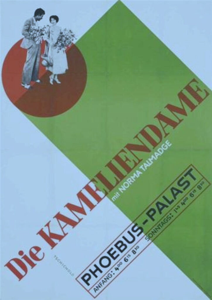
Image 1. Die Kameliendame Phoebus Palast Norma Palast found in The International Advertising & Design Database (IADDB).
 Rocío Vázquez Varela de Seijas
Rocío is an artist and graphic designer with a special interest in advertising and the psychology of communication. She cherishes to reflect on the way we as a society perceive art, advertising, movies or popular culture. You can reach her at roxiovazquez@gmail.com.